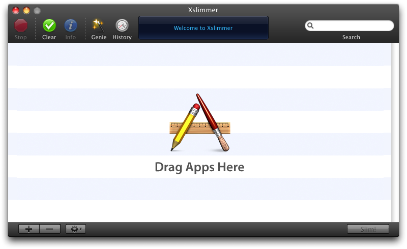
During the summer of 2007, Louie Mantia challenged us to produce a black themed version of Xslimmer. As Leopard approached, we were thinking that providing Xslimmer with face lift was a good idea. So, making Xslimmer black would made it look nicely different. At that time, it did sound as something simple: just make the grey areas of the window become black, and the black ink become white. Easy.
I started developing the window part. Fortunately, some people had walked that path before me. Making the window black was relatively easy. Using a background image for the window title + toolbar area was the only tricky part, as, in the beginning, it was not correctly rendered. The top half of the image was drawn in the bottom half of the toolbar, and viceversa. Fortunately, I discovered that setting something called "the pattern phase", within the graphics context, cured the wound. The black window was done.
Next step was to make the toolbar font white. I checked the documentation. Nothing. Checked Cocoa development sites. Nothing. Checked everywhere I could think off. Nothing. Asked other developers. Nada. How could it be? Similarly to the guys in Panic, who were fighting to get access the 3 bottom pixels of NSToolbar, we just wanted to draw white text with a bit of grey shadow, and make the black dotted lines, white dotted lines. That was all. I tried every hack possible, subclasses, all sort of undocumented stuff to try to get access to the text rendering part, so I could invert the colors. Nothing.
My first thought was: "I will just build the toolbar using Interface Builder". Then, I started to design how it would work and operate. I soon realized that it was not going to be an easy task. Not only would I had all sort of issues placing the different pieces of the toolbars, but also controlling them during run time. In addition, Xslimmer already used toolbars in 4 different places, so the code to manage them was already there and would need major rework.
I decided it was time to create our own toolbar management system, a system that would operate in the same fashion as Apple's, but that would provide the needed flexibility. This would allow us to not change the existing toolbar management code, and, at the same time, make the text color any color we wanted. It took a while, but it was fun, and the results paid up:

It was time to get other people's opinion. So, during our beta testing phase, we had a poll. Most of our users did not fully like the dark theme. We held several internal discussions and finally went back to a more "Leopard-like" look, the one that Xslimmer uses today. Given the fact that code for toolbar management was unchanged, rolling back was trivial.
So, at the end, we never used the newly developed toolbar system. At that time, Chris Messina suggested that there might be some interest out there in continuing its development, that we should open source it. To make the toolbar system open source would imply some work: I would have to extract the toolbar and window code, produce a sample application, etc. So, prior to making the effort, I was wondering: Would anyone be really interested?

3 comments:
Should this exist on an individual application basis? No, I don't think so.
Much more desirable is a universal Leopard skinning app. The hurdle = resolution independent UI.
Cool concept though. If apple went completely light on dark, dark hardware, etc, that would also be.. interesting? ha.
I think it's cool that you have created your own toolbar controller. I am currently starting out developing in cocoa and it's nice to see you don't have to stick with NextStep's objects or i mean Apples ;)
I think you should release it as it always feels nice when you release some open source code :)
I love the alternative theme. I really would love to see this as an option in a future release.
I'm amazed that you wrote the whole toolbar from scratch. But I think Apple should either implement a new interface type in 10.6 that is skinnable by developers for third party apps (but this won't happen), or Apple should have in the system preferences, an option for two or three different system wide themes. They should keep the grey/metal that they have now, but include maybe a white or a black/dark grey one as well.
Come on Apple we are bored of grey!
Post a Comment