Showing posts with label Design. Show all posts

Saturday, January 30, 2010

Sketches 1 and 2: Two Products in the App Store

As some of you might already know Sketches 2 is available on the App Store. Also, the original Sketches is still available as a different product.

When Sketches was created, it was a simple drawing application. It had no menus, no color or line width selection, or anything else. You were able to draw using a red line of fixed width. When the application was closed, it stored the document. When the device was shaked, the drawing was erased. With each new update, thousands of downloads occurred, a clear indication that there was interest for such a product.

In version 0.3 of this jailbroken world, we added several options to choose color and make some simple geometric shapes using the multitouch capabilities of the iPhone. This version was a big push, and made Sketches even more popular.

When Apple announced the SDK, along with the App Store, Pedro and myself seriously considered the idea of making this our way life. For several months we worked in making Sketches a more complete product, while converting it to the official SDK.

On July 10th 2008, Sketches was among the initial group of apps to make it into the store. It was also featured on Ars Technica and promoted by Apple in the European Union. For us, it was a big success. We made $150,000 during the first three weeks of sales.

During the next months we worked on adding the features we had originally designed for version one, while resolving any bugs that appeared. We added text shape creation, tooltips, additional stamps, web sharing, improved image flattening, fixed memory issues, fixed map rendering issues on certain locations, improved mail sending of drawings, added ink opacity options, added corkboard rearrangement, improved zoom, improved saving performance, etc.

At the same time, we received many different requests to make Sketches a more professional product, featuring an advanced color picker, transparency, brushes, more zoom and so on. As we designed these features, we realized that the existing UI was not able to hold them. In addition, we would need to change the way things are done to fit this new functionality (for example, a progressive zoom that worked like in the photo album would need the shape placing mechanism to be changed). Finally, we were taking little advantage of the new 3.0 SDK functionalities. It was time to move onto version 2.

When we designed Sketches 2, we decided to make it 3.0+ only, and to change the menu system, looking to achieve 2 things:

  • 1. Be able to work while having the menus open, so you could change the ink color or other options without having to reopen the menu every time.

  • 2. Keep the original simplicity, while adding the advanced options
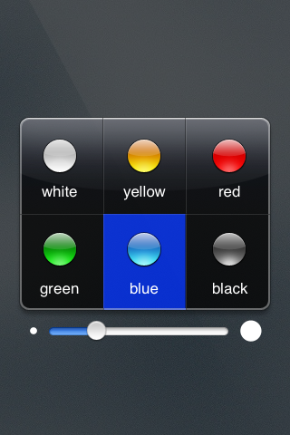
    IMG_0001.1.PNG

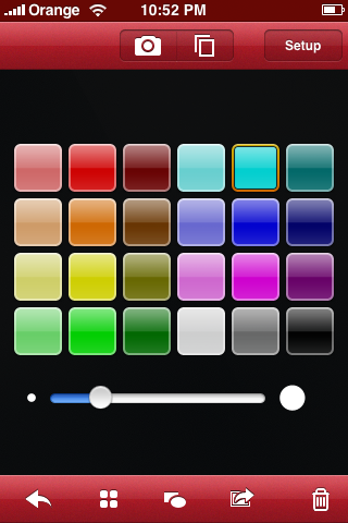
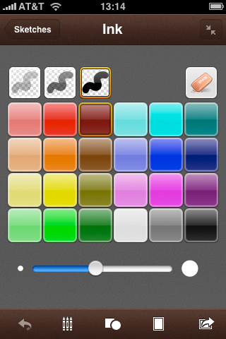
    Sketches1ColorPicker.pngSketches2ColorPicker.png


(example of Skeches UI evolution)

Once the product was almost ready, we saw that the changes were many, and made it a different product, with different usage. So, for the time being, Sketches 1 and 2 are going to be living together in the App Store. We probably could have called them something like "Sketches" and "Sketches Pro" or "Sketches Classic" and "Sketches Advanced", but we liked "Sketches" and "Sketches 2" better.

We did not want, however, to forget those users who welcome change and are looking for the new Sketches 2 features. So, for a few more hours, we are still promoting Sketches 2. The promotional price is just $1.99. Take advantage of it!

For us, it is time to get Sketches 2 onto the iPad!

Tuesday, April 15, 2008

Dark Xslimmer's Toolbar

A few days back, I watched Cabel Sasser's C4 presentation. I thought it was a very nice presentation, with some insightful bits that can only be produced out of experience. I particularly enjoyed the part where he explains why they had to create their own toolbar. We had to do the same.

During the summer of 2007, Louie Mantia challenged us to produce a black themed version of Xslimmer. As Leopard approached, we were thinking that providing Xslimmer with face lift was a good idea. So, making Xslimmer black would made it look nicely different. At that time, it did sound as something simple: just make the grey areas of the window become black, and the black ink become white. Easy.

I started developing the window part. Fortunately, some people had walked that path before me. Making the window black was relatively easy. Using a background image for the window title + toolbar area was the only tricky part, as, in the beginning, it was not correctly rendered. The top half of the image was drawn in the bottom half of the toolbar, and viceversa. Fortunately, I discovered that setting something called "the pattern phase", within the graphics context, cured the wound. The black window was done.

Next step was to make the toolbar font white. I checked the documentation. Nothing. Checked Cocoa development sites. Nothing. Checked everywhere I could think off. Nothing. Asked other developers. Nada. How could it be? Similarly to the guys in Panic, who were fighting to get access the 3 bottom pixels of NSToolbar, we just wanted to draw white text with a bit of grey shadow, and make the black dotted lines, white dotted lines. That was all. I tried every hack possible, subclasses, all sort of undocumented stuff to try to get access to the text rendering part, so I could invert the colors. Nothing.

My first thought was: "I will just build the toolbar using Interface Builder". Then, I started to design how it would work and operate. I soon realized that it was not going to be an easy task. Not only would I had all sort of issues placing the different pieces of the toolbars, but also controlling them during run time. In addition, Xslimmer already used toolbars in 4 different places, so the code to manage them was already there and would need major rework.

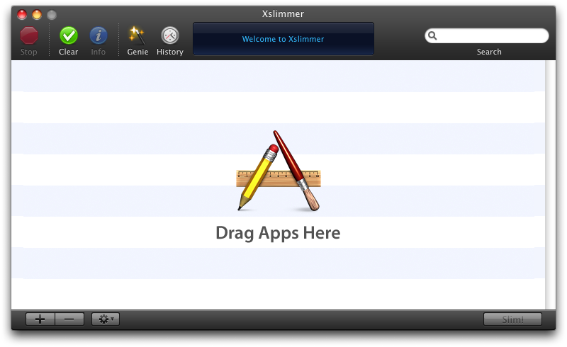
I decided it was time to create our own toolbar management system, a system that would operate in the same fashion as Apple's, but that would provide the needed flexibility. This would allow us to not change the existing toolbar management code, and, at the same time, make the text color any color we wanted. It took a while, but it was fun, and the results paid up:

Xslimmer Dark.png


It was time to get other people's opinion. So, during our beta testing phase, we had a poll. Most of our users did not fully like the dark theme. We held several internal discussions and finally went back to a more "Leopard-like" look, the one that Xslimmer uses today. Given the fact that code for toolbar management was unchanged, rolling back was trivial.

So, at the end, we never used the newly developed toolbar system. At that time, Chris Messina suggested that there might be some interest out there in continuing its development, that we should open source it. To make the toolbar system open source would imply some work: I would have to extract the toolbar and window code, produce a sample application, etc. So, prior to making the effort, I was wondering: Would anyone be really interested?

Friday, April 27, 2007

Big thanks for all comments about Xslimmer 1.2.3

As you probably have seen, we have released Xslimmer 1.2.3 some days ago. We wanted to thank you on all the comments we received, both public and private, about the beta version.

We hope to have included the best options based on your comments. For example, we made sorting headers optional. They are accessible through the main window via the gear button. We also used the 1.2.2 icons for Stop and Clear, and definitely took out the dividers. You can check the full release notes here: http://www.xslimmer.com/download/.

We hope you keep enjoying Xslimmer.

Thursday, April 05, 2007

Xslimmer 1.2.3 Beta Updated / Design Poll

So far, no bugs have been detected, but we have updated Xslimmer 1.2.3 beta in order to reflect some suggestions from different testers, along with some other minor changes in Localization and blacklist. You can download it here: Xslimmer 1.2.3b3 download.

In addition, we would like to hear which of the following designs you prefer:


(Current Xslimmer, 1.2.2)

(Xslimmer 1.2.3 b2)


(Xslimmer 1.2.3 b3)

As you can see, the main change is the existance of the headers, which will allow sorting the apps by the criteria of your choice, including number of languages or architecture type, along with the existence of column dividers (which do not add any functionality itself). Any thoughts, really appreciated.

Sunday, October 15, 2006

We are getting there!


This is how the initial version of Xslimmer used to look. We thought we were almost done. Every aspect of functionality we wanted to add for v1.0 was there. Then we met Louie Mantia. He redesigned the interface, and a month later, we are still working to get it right. We have changed the look significantly, hoping users will like it better. Soon you will be able to judge for yourself.